
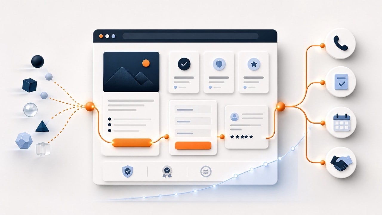
A high converting website does more than look professional. It helps the right visitor understand what the business offers, decide whether the offer fits, and take an appropriate next step. That step might be a call, form submission, appointment, pricing request, purchase, or another action that creates measurable progress.
Websites that convert are not built by placing more buttons on every screen. They are built by reducing the uncertainty and friction that prevent qualified visitors from acting. Clear strategy, useful content, credible proof, accessible design, dependable technology, and consistent follow-up work together as one business system.
That is why conversion-focused website design should begin with the business and its customers rather than a visual template. The website must support the services the company most wants to sell, answer the questions customers ask before buying, and make the next decision easier. Design then gives that strategy a clear and trustworthy form.
What Is Website Conversion?
A website conversion occurs when a visitor completes an action the business has defined as valuable. An ecommerce company may prioritize completed purchases, while a service business may prioritize qualified calls, booked consultations, estimate requests, or completed lead forms. A newsletter signup can matter, but it should not be treated as equal to a sales opportunity unless it plays a meaningful role in the customer journey.
Google Analytics describes an important business action as a key event. A session key-event rate measures the percentage of sessions in which at least one of those actions occurred. The useful number is therefore not a universal conversion benchmark; it is the rate at which the right visitors complete the right action for this particular business.
A website can increase its reported conversion rate by measuring easy but low-value actions, yet that does not mean the site is producing better business results. Measurement should distinguish meaningful inquiries from spam, existing-customer support requests, job applicants, and other activity that does not represent the intended opportunity. Conversion quality matters alongside conversion quantity.
A High-Converting Website Starts Before the Page Is Designed
Conversion problems often begin upstream from the layout. The website may attract people who want something the business does not sell, promote an offer the company does not want to grow, or send visitors to a page that does not match the promise made in search results or advertising. Improving buttons and colors cannot repair a fundamental mismatch among the audience, offer, message, and destination.
The first decision is therefore strategic: identify the priority service, the ideal customer, the questions that influence the purchase, and the action that represents qualified progress. SEO should attract qualified demand, while the website helps that demand understand and choose the offer. When those jobs are planned together, traffic and conversion support the same business objective.
The 9 Elements of a High-Converting Website
1. A Clear Priority Message
A visitor should quickly understand what the company does, who it helps, and why the page is relevant. The opening message should reflect the visitor’s likely problem and the specific offer available on that page. Clever slogans can support a brand, but they should not force the visitor to decode the business before deciding whether to continue.
Clarity does not require reducing every message to a few words. It requires presenting the most important information first and developing the explanation in a logical order. A strong headline earns attention by being useful, while the supporting copy gives the visitor enough context to evaluate fit.
2. Structure Based on Customer Decisions
A high-converting website is organized around the way customers evaluate a decision, not the company’s internal departments. Navigation, service pages, industry pages, location pages, and supporting resources should help visitors find the answer that matches their situation. The sequence of information should move from understanding the problem to evaluating the solution, verifying credibility, and selecting the next step.
This customer-centered structure also supports search visibility because it creates clear relationships among important topics and pages. Search engines can more easily understand which page represents a service when the architecture, internal links, headings, and content reinforce the same purpose. Visitors benefit from the same clarity because they are less likely to become lost among overlapping or poorly labeled pages.
3. Answers to the Questions That Delay Action
Prospective customers rarely hesitate because they need another adjective describing the company as innovative or trusted. They hesitate because they still have questions about price, process, timing, suitability, risk, alternatives, outcomes, or what happens after they inquire. A page that addresses those concerns honestly can reduce uncertainty without resorting to pressure.
The Shapes and Pages SEO Methodology treats customer questions as evidence for what the website must explain. The highest-value commercial pages should answer the questions that belong close to the purchase decision, while supporting articles can explore broader questions in more depth. Intentional internal links should connect those resources so the visitor can continue learning without starting over elsewhere.
4. Proof Placed Near the Claim
A claim becomes more persuasive when the visitor can verify it. Relevant testimonials, project examples, certifications, process details, team experience, measurable outcomes, and clear policies can all reduce perceived risk. The best form of proof depends on what the visitor must believe before taking the next step.
Proof should be specific enough to carry meaning and placed near the point where doubt is likely to occur. A generic testimonial isolated on a separate page may be less useful than a relevant example beside the service claim it supports. Results should include enough context to explain the baseline, work completed, measurement period, and limits of attribution.
5. One Obvious and Appropriate Next Step
Every important page should make the next action clear, but that does not mean every visitor is ready for the same commitment. A high-intent service page may invite a consultation or quote request, while an educational article may direct the reader to a relevant service, guide, or assessment. The call to action should match the visitor’s stage and explain what will happen after the click.
Too many competing actions can make the visitor postpone all of them. Primary and secondary actions should have an intentional hierarchy, and button language should describe the outcome rather than rely on vague labels such as Submit or Learn More. Repeating a primary action can help on a long page when it appears at logical decision points instead of interrupting every section.
6. Low-Friction Forms and Contact Paths
A form should collect the information needed to respond appropriately, not every detail the company might eventually want. Each additional field creates another decision and another opportunity for abandonment, yet removing all qualifying questions can create low-quality inquiries and extra administrative work. The right form balances visitor effort with the information required for a useful next conversation.
Forms should also be easy to understand and use. The W3C Web Accessibility Initiative recommends clearly associated labels, identifiable interactive elements, sufficient contrast, and useful feedback when an interaction succeeds or fails. Those practices support people with disabilities and create a more predictable experience for every visitor.
7. A Fast, Responsive, Accessible Experience
Visitors cannot respond to an offer they cannot comfortably use. Pages should load dependably, adapt to phones and tablets, maintain stable layouts, and make essential content and controls easy to find. Performance work should focus on removing friction from important customer journeys rather than pursuing a perfect diagnostic score without regard to business impact.
Accessibility belongs in conversion planning because clarity, contrast, labels, keyboard support, meaningful headings, and understandable feedback affect whether people can complete an action. These requirements should be considered during strategy, design, content, and development rather than added after launch. A site that excludes part of its audience is not a high-converting site, regardless of how polished it appears.
8. Follow-Up Connected to the Website
The conversion does not end when a form displays a thank-you message. The inquiry must reach the right person, preserve the information needed for follow-up, and trigger a response within an appropriate timeframe. Missed notifications, unclear ownership, disconnected spreadsheets, and delayed replies can erase the value created by the website.
Forms, booking tools, call tracking, CRM systems, email, text messaging, and marketing automation should support a defined customer process. The workflow should account for data fields, notifications, ownership, exceptions, privacy needs, and what happens when an integration fails. Automation creates value when it makes communication more consistent without making the relationship feel impersonal.
9. Measurement and Continuous Improvement
A conversion-focused website is not finished at launch because customers, competitors, traffic sources, technology, and business priorities continue to change. Analytics should identify the pages and journeys that generate qualified actions, not merely the pages that accumulate visits. Call tracking, forms, booking data, CRM outcomes, and sales feedback can provide context that a top-line conversion rate cannot.
Measurement should lead to a prioritized opportunity list rather than an endless collection of dashboards. The next improvement may involve a technical issue, unclear copy, missing proof, a weak offer, a confusing form, a traffic-quality problem, or slow follow-up. Work should begin with the highest-impact problem that can be addressed within the available budget.
Why Attractive Websites Still Fail to Convert
Visual quality matters because people use design as one signal of credibility and professionalism. However, appearance cannot substitute for a clear offer, useful information, relevant proof, dependable functionality, or a sensible next step. A beautiful website can still underperform when it makes the visitor admire the design without understanding the business.
Another common failure is treating conversion as a page-level design problem when the journey is broken elsewhere. The advertisement may promise something the landing page does not explain, the service page may attract the wrong search intent, or the sales process may fail to respond after the inquiry. Conversion improves when the entire path from discovery through follow-up supports the same expectation.
How to Improve Website Conversion Rate Without a Full Redesign
Find the Highest-Value Journey
Begin with the service or product the business most wants to grow and identify the pages involved in that customer journey. Review how qualified visitors arrive, what they need to understand, where they leave, and whether completed inquiries become real opportunities. This prevents a sitewide redesign from consuming the budget when one important page or workflow may be the actual constraint.
Define a Trustworthy Baseline
Confirm that analytics, forms, calls, bookings, and CRM outcomes are being recorded accurately enough to support a decision. Separate total activity from qualified activity and document the measurement period, traffic source, device, and page when those differences matter. A baseline does not need to be perfect, but it should be credible enough to show whether a change helped.
Improve One Constraint at a Time
Prioritize the change most likely to affect the business outcome, such as clarifying the offer, adding missing proof, simplifying a form, fixing a mobile problem, or aligning a landing page with its advertisement. Make the change, allow enough time and volume for useful evidence to develop, and compare the result with the baseline. Reprioritize from what you learn instead of changing several unrelated elements and guessing which one mattered.
What Is a Good Website Conversion Rate?
There is no single conversion rate that defines a successful website. Rates vary by business model, traffic source, offer, price, device, customer urgency, sales cycle, geographic market, and the action being measured. A completed purchase, a qualified consultation request, and an email signup should not be compared as though they represent the same level of commitment.
A useful benchmark begins with the website’s own qualified baseline and the economics of the business. A lower rate can still create more value when the inquiries are better qualified, while a higher rate can be misleading when it is driven by low-value actions or irrelevant traffic. The responsible goal is not the largest percentage; it is a sustainable increase in the customer actions that contribute to growth.
Build a Website That Converts—and Keeps Improving
High-converting website design is not a collection of tricks. It is the coordinated work of attracting appropriate visitors, explaining the offer clearly, answering meaningful questions, establishing trust, removing usability barriers, supporting a sensible next step, and following up reliably. Each element strengthens the others when they are built around the same customer decision.
The most practical starting point is to identify where the current journey breaks down. One business may need a new website, while another may need a stronger service page, clearer message, faster form, improved tracking, or better lead response. The right investment is the one that makes the website a better answer and produces evidence for what should improve next.
If your website attracts visitors but does not consistently turn them into qualified opportunities, start with a Shapes and Pages Website Assessment. We will evaluate the business priorities, customer questions, search visibility, content, conversion paths, technical condition, and connected workflows. The result is a practical explanation of what should be improved first, what can wait, and where the available budget can create the most value.
Sources
Google Analytics Help: About key events
Google Analytics Help: Traffic acquisition report and session key-event rate
W3C Web Accessibility Initiative: Designing for Web Accessibility